Jerusalem District Police
Industry
Government & Public Safety
Service
Logo redesign
The Jerusalem District Police launched a redesign initiative to modernize their visual identity while preserving the legacy and recognition of their longstanding emblem. The project aimed to bridge tradition and progress, ensuring the new logo maintained continuity with the past while meeting contemporary design standards for clarity and versatility.

The Challenge
The core challenge was balancing modernization with heritage how to refresh the logo without losing its historical significance and public familiarity. The existing emblem carried decades of institutional trust, so the redesign had to evolve its aesthetics (outdated typography, cluttered details) while retaining key symbolic elements that resonated with both officers and the community.
Creative Solution
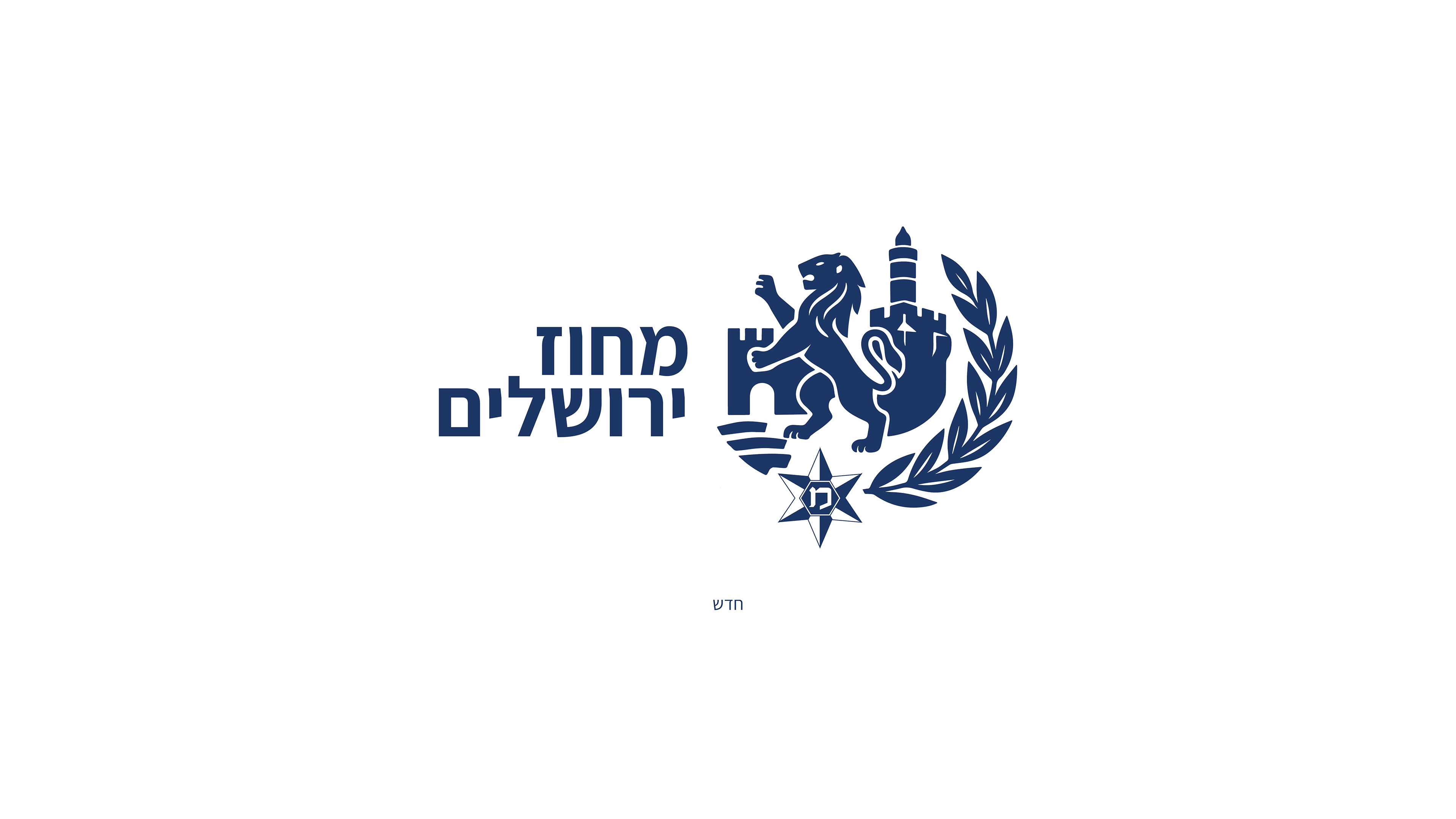
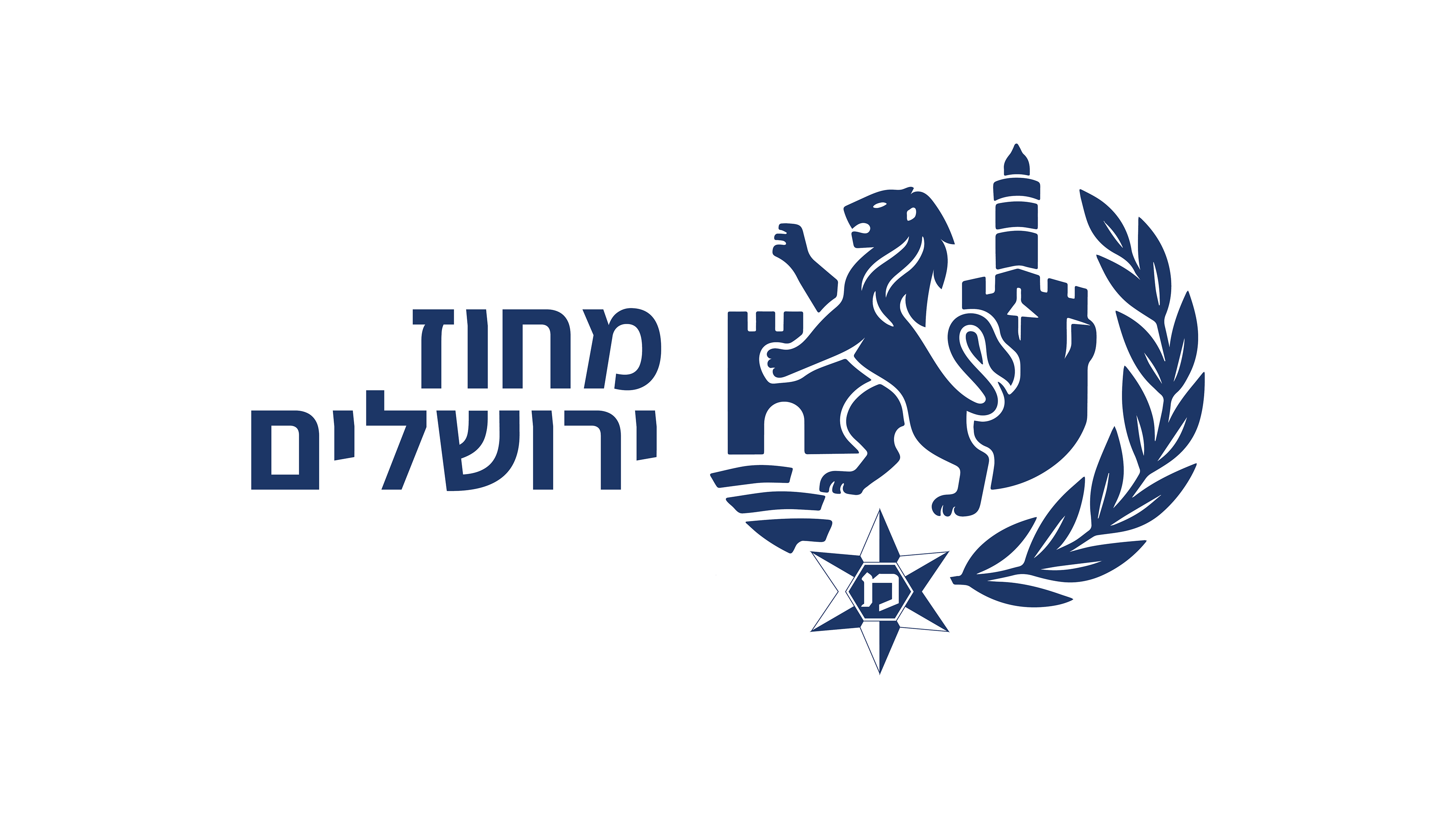
The redesign modernized the Jerusalem District Police logo by simplifying its core elements while preserving key symbols like the Lion of Judah. The updated version features cleaner shapes, bolder typography, and improved scalability retaining recognition while enhancing functionality across all media.